Kindle Voyage Review
Review Date: November 2014 - Review unit purchased from Amazon
Overview
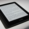
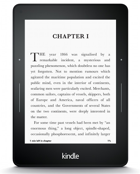
The Kindle Voyage is Amazon's latest ebook reader and is their first attempt at what would be considered a premium ereader when compared to other Kindles. It has a new thinner design and is the first Kindle to have a flush glass screen, page turning sensors, and a 300 ppi E Ink display.
The Kindle Voyage sells for $199 in the US for the Wi-Fi model with Special Offers. It costs $219 without ads. There's also the option to add 3G wireless for $70 more. Amazon continues to offer the Kindle Paperwhite as well, in addition to the new entry-level $79 Kindle.
Quick Review: Kindle Voyage
Pros- Text looks super sharp and clear thanks to the 300 ppi E Ink screen.
- Best contrast of any Kindle yet, has the darkest text and the whitest background.
- The PagePress sensors give a nice alternative to swiping the screen.
- The flush screen and new overall design is an upgrade over other Kindles, and gives it more of a premium feel.
- Possibility of subtle tone variations with the frontlight from the top of the screen to the bottom.
- No added software benefits or improved performance over the cheaper Kindle Paperwhite or $79 Kindle—all have the same 1GHz processor and offer the exact same reading features.
- High price for an ebook reader, especially the 3G model at $289 without ads.
In my first impressions review, I mentioned how I wasn't as impressed with the Kindle Voyage as I thought I would be. The screen is absolutely spectacular but the frontlight isn't perfect, the page sensor buttons take some getting used to and the feedback they give off is downright annoying. But there's a reason that I don't post full reviews a couple of days after getting a new device to test (like most tech review sites). I think it's better to actually use the device regularly for at least 2 weeks before finishing a review.
After using the Kindle Voyage as my main ebook reader over the past few weeks, my overall opinion about it has changed. It does have its flaws—the device isn't perfect—but that doesn't stop it from being one of the best ebook readers on the planet. The clarity of the E Ink screen is truly spectacular, the whiter background and darker text really stand out, and the page sensors are quite pleasant once you get accustomed to using them. Overall the device offers an outstanding reading experience.
In my opinion, the biggest problem with the Kindle Voyage is the price. A lot of people think it is too overpriced, and I still think that myself after using it, especially when you add the price of a cover and the cost to remove the ads. Unless you really want the super high resolution screen and page sensor buttons, the Kindle Paperwhite provides a better overall value and offers all the exact same software features. Its priced $80 lower and sometimes goes on sale for $99. It's hard to recommend paying twice as much for the Voyage just to get a slightly better screen and page sensor buttons.
Kindle Voyage Video Review
Comparison Review: Kindle Voyage vs Kindle Paperwhite »
Hardware and Design
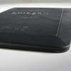
With the Kindle Voyage Amazon introduced a completely new design. On the surface it kind of looks like other Kindles at first. But when it's in your hand you can really tell how different it is from previous Kindles. The front has a flush glass layer like a tablet. The device is exceptionally light and thin, almost too thin to hold at the edges that taper down to about an eight of an inch. The thinness really makes the Kindle Voyage perfect to hold in a cover, however, which all ebook readers should have anyway because of the fragility of E Ink screens.
The overall thickness of the Voyage is 1.5 mm less than the Paperwhite, and the overall weight is one ounce less. That doesn't sound like a lot but you can really feel the difference in person.
Aside from the aesthetic upgrades, the Kindle Voyage offers its own unique set of hardware features that aren't offered on any other ebook readers. It's the only E Ink ereader with a 300 ppi screen, an auto-brightness sensor, and page turn sensors that cause the device to give off feedback when pressed.
When it comes to the processor and available storage space, the Voyage is exactly the same as the lower-priced Kindles, so there is no benefit in that regard. The early video reviews from CNET said that the Kindle Voyage has double the RAM. If so, there's no noticeable difference with overall speed or loading times whatsoever when compared to the Paperwhite and $79 Kindle.
The Screen
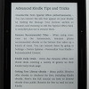
There's no question that the screen is the best thing about the Kindle Voyage. The clarity of the 300 ppi E Ink Carta display is indeed impressive, better than anything else on the market right now. Text is noticeably darker and the background is noticeably whiter than any other ebook reader. Fine details in images and small fonts are especially clear. That being said, the difference isn't that noticeable unless you have two devices side-by-side. It's not like the Paperwhite with it's 212 ppi screen is any harder to read, fonts are just a little fuzzier.
The Frontlight
The only disappointing thing about the Kindle Voyage for me is the frontlight. When paying a premium amount for an ereader you expect it to be perfect. And unfortunately the frontlight isn't perfect. In fact it's not even as uniform as the frontlight on my Kindle Paperwhite 2. The Voyage has sort of an orange gradient at the top of the screen. Ninety percent of the time it's virtually undetectable, especially when using auto brightness and on lower brightness settings, so it's really not as big of an issue as it would seem.
But there are times when it is distracting and takes away from the reading experience. The gradient is more apparent with the brightness turned up high, and when reading at night in a dark room. It's especially noticeable when using landscape mode to read because each line goes from light to dark.
Frontlights vary a lot from one device to the next, however, so it's always hard to know what you're going to get. The Kindle Voyage has been getting complaints about the uneven lighting and different-colored hues from reviews on Amazon as well, so it's not an isolated issue. The variance it subtle enough that most people don't even notice it unless it is pointed out to them, so for most it's not a problem at all. But if you're super picky about screens and notice details like that it might bother you enough to return it.
Auto-Brightness Sensor
When it comes to the auto-brightness sensor, nothing has changed from my initial review. I really like the sensor when it works. It automatically adjusts the frontlight under different lighting conditions, and does so slowly enough not to be jarring. I never like auto-brightness on tablets because they over adjust and are usually too bright. But the Voyage keeps the level nice and dim, perhaps too dim for some, however.
The thing with the auto-brightness sensor is that it doesn't always seem to work. I don't know if it's a software bug or a defective sensor, but sometimes I sit there waiting for it to adjust and it does nothing. After a few minutes I get annoyed and adjust it myself. I don't know what the deal is with it but it's not 100% consistent.
PagePress Sensors
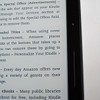
In my first impressions review, I talked about how I was on the fence with the PagePress sensors because I found them somewhat difficult to use. With large hands, it's hard to hold the Kindle Voyage in such a way to make using the sensors comfortable. This is mainly because the edges are so thin there's not enough to hold onto. But I've found that using a cover cures this with the added thickness, and makes using the page sensors a lot more pleasant, at least for me personally. I still think the page back sensor is too high to comfortably reach, however, and find swiping the screen to be more convenient for paging back.
After you get used to them, the page turn sensors do work well and are a nice alternative to moving your thumb over and swiping the screen, but when it comes right down to it I think that real buttons like on the Onyx Boox T68 are more functional and pleasant to use. With a sensor, there is no give or feel of a button; it's no different than pressing anywhere on the screen, and at night you can't see the sensors or feel them.
One good thing about the sensors is it's hard to accidently activate them. There are three pressure settings you can select in the settings menu. Even on the lowest pressure, you still have to physically press the sensor for it to activate. Simply tapping it or brushing over it does not activate the sensor like when using the touchscreen.
In addition to the PagePress sensors, the Kindle Voyage has the option to give off feedback when pressing the sensors. There are three levels of feedback you can select from in the settings menu, and it can also be turned off. When you press a page sensor, it makes it so the Kindle vibrates slightly. Personally I find it completely distracting. It's even jarring on the lowest setting and takes me immediately out of a book. I don't understand why you'd need to feel a vibration while pressing a sensor when you can see the page turning. But to each their own...
Software Features
The thing with the Kindle Voyage is the software is exactly the same as the Kindle Paperwhite and $79 Kindle. So for all the extra money it costs, you're not getting a single extra software-related feature that's not offered on the $79 Kindle. The only difference is a couple subtle variations to things like the menu bar and settings menu for the added hardware features to adjust things like the page sensor pressure and frontlight brightness.
The only other difference software-wise with the Kindle Voyage is that it doesn't support Active Content (games and apps). Amazon has decided to drop support for Active Content on newer Kindles, so only the Kindle Paperwhite and older Kindles can display Kindle games and apps.
The homescreen displays content using cover view. You can also switch to classic list view from the settings menu. Like all Kindles there are two sections: one for cloud content and one for on-device content. Sorting options include by title, recent, author, and collections, and there are sub categories for books, periodicals, personal documents, and collections. There's a recommend reading section that displays on the homescreen by default, but it can be turned off in settings.
Kindle Reading Features
Notes and Highlights: While reading, holding down on a word or holding and dragging across multiple words brings up the option to add highlights as well as text notes using the onscreen keyboard. Annotations can be viewed from the menu , and from the clippings file on the Kindle. They can also be viewed and edited online at Amazon, and the clippings file can be exported and edited using 3rd party programs. Additionally, the Kindle has a feature called public notes and highlights that displays the most frequently highlighted passages within ebooks, along with notes. This can be toggled on and off in settings.
Font Choices: The Kindle offers six different font choices: Baskerville, Caecilia, Caecilia Condensed, Futura, Helvetica, and Palatino.
Text Adjustment: All Kindle devices and apps have the same three line spacing and margin settings. And there are 8 font sizes to choose from.
Bookmarks: Tap in the upper right hand corner when reading to add and remove bookmarks. A list pops up that shows other bookmarks in the ebook, and tapping on them opens a second window to view the bookmarked page without leaving the current page.
Dictionary: Holding down on a word opens the dictionary window. From there you can scroll through the definition and select which dictionary to use in the lower right. You can also choose to open the full dictionary. The Kindle comes with two English dictionaries pre-loaded. More dictionaries can be added from the Kindle Store, several foreign language dictionaries automatically get added to the cloud after purchasing a Kindle.
Instant Translations: The Kindle has a translation feature that can translate single words or entire sentences into a number of languages without leaving the ebook. It uses Bing Translator so an internet connection is required. Languages include Chinese (simplified and traditional), Danish, Dutch, English, Finnish, French, German, Hindi, Italian, Japanese, Korean, Norwegian, Portuguese, Russian, and Spanish.
Reading Progress Indicator: The Kindle has an estimated reading speed timer that displays in the lower left corner that gives an estimate of how long it will take to finish a chapter or the rest of the book based on your reading speed. Tapping the lower left corner switches from chapter to book to location. It can also be toggled off.
Table of Contents: The Kindle has a "go to" function that open a book's table of contents to easily jump around the different parts of a book. You can also select to jump to the beginning or a specific page or location.
Fast Page Scan: Aside from the TOC window, another way to navigate an ebook is to tap on the top of the screen to open the menu bar, and then tap on the tab at the bottom of the page. This opens a second window where you can use a quick page scan feature to skim through a book. There are also buttons to move forward and back by chapter, along with a page dial to jump around parts of a book quickly.
X-Ray: This feature analyzes the "bones of the book" and shows passages about common themes, characters, historical figures, and specific places or topics in a book. X-Ray then offers descriptions about them from Wikipedia and Shelfari.
Search: The Kindle has an advanced search feature that is always accessible from the menu bar. It uses predictive search so you usually only have to type the first few letters when searching ebooks. You can choose a number of places to search, including this book, my items, all text, Kindle store, Goodreads, dictionary and Wikipedia.
Sharing: You can share passages and messages on Goodreads, Facebook and Twitter.
Goodreads Integration: The Kindle has the option to connect with your Goodreads account to see what your friends are reading, share highlights, and rate the books you read. You can add books to your "Want to Read" shelf, update reading status, and more.
Landscape Mode: The Kindle has the option to switch to landscape mode for ebooks and PDFs, but not other parts of the interface.
Language Support: The following languages are available in the settings menu: English (US or UK), German, Spanish, French, Italian, Dutch, Russian, Chinese, Japanese, and Brazilian Portuguese..
Parental Controls: There are parental control settings to restrict access to the Kindle Store, Cloud items, Goodreads, and web browser.
Kindle FreeTime: This lets parents setup profiles for kids where parents can choose specific books for their kids to read. Parents can set reading goals and track progress while kids earn badges and awards for reading. This can be used with books you own as well as books through the subscription-based Kindle FreeTime Unlimited program with kid-friendly books.
About the Author: Within a book you can select to learn more about the author, which loads a page with a description about the author along with a list of their published work.
Whispersync: This keeps your last page read, bookmarks, notes and everything else in sync across multiple Kindle devices and apps.
In-line Footnotes: Opens a second window when tapped instead of leaving the page.
Word Wise: A new feature that makes it easier to read more challenging books. Short and simple definitions automatically appear above difficult words. Tap on a word to bring up a simple card with definitions, synonyms, and more. You can adjust the number of hints you see with a slider bar.
Vocabulary Builder: Whenever you lookup a word in the dictionary, it automatically gets added to a vocabulary builder list where you can study the words and definitions along with flashcards. This feature can be turned on and off in settings.
Partial Page Refresh: In the settings menu there's the option to turn on and off partial page refresh. Partial refresh is faster but it can lead to more ghosting and afterimage effects. Full page refresh flashes more but it helps make the text appear sharper and darker.
Web Browser: The Kindle has an "experimental" web browser. It is very basic but it can be used for things like reading news sites, referencing Wikipedia, and downloading DRM-free ebooks from websites and Dropbox. The browser offers an article mode that looks nice. Overall the Kindle's web browser is difficult to use because it loads slow, scrolling is wonky, and it crashes frequently.
Non-Amazon Content: The Kindle connects to Amazon's ebook store for ebooks and periodicals. You can also borrow library ebooks for the Kindle, get lots of free ebooks, and shop for DRM-free ebooks from various websites too. Epub formatted ebooks can even be easily converted to Kindle format.
Additional Kindle Voyage Reviews
- Kindle Voyage PDF Review
- Kindle Voyage vs Kobo Aura H2O Comparison
- Kindle Paperwhite vs Kindle Voyage Comparison
Kindle Voyage Specs
- 6" E Ink Carta display.
- 1448 x 1072 pixel resolution (300 ppi).
- Adaptive frontlight that adjusts automatically.
- Capacitive touchscreen, flush with the bezel.
- PagePress page turning sensors.
- 1 GHz processor, 512MB RAM.
- 4GB internal memory.
- Wi-Fi 802.11 b/g/n.
- Optional 3G.
- Supported formats: Kindle Format 8 (AZW3), AZW, TXT, PDF, unprotected MOBI, PRC; HTML, DOC, DOCX, JPEG, GIF, PNG, BMP through conversion.
- Battery Life: up to 6 weeks.
- Weight: 6.3 oz – 180 grams.
- Dimensions: 6.4″ x 4.5″ x 0.30″ (162 mm x 115 mm x 7.6 mm).
- Price: $199-$289 at Amazon.


