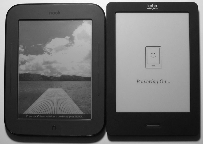
Nook Touch vs Kobo Touch
Intro
The Kobo Touch and Nook Touch have a lot in common. They were both released about the same time, both have 6" E Ink Pearl screens, use NeoNode's infrared touchscreens, have 2GB of internal memory, microSD card slots, WiFi, Adobe DRM support, and both share a number of software features too.
From a design perspective they appear similar, but there are subtle differences between them. The Nook's bezel is wider and has page-buttons built into the sides, the corners are more rounded and the edges tapered, the memory card slot is covered, the back is contoured, and there's a power button on back.
The Kobo has a quilted back, a narrow bezel with a larger section to hold below the screen, an open memory card slot, and power slide for the turning the device on and off.
Both have one hardware button below the screen. On the Kobo it directs to the homescreen and on the Nook Touch it brings up options for going to the homescreen, the library, ebook store, search, and settings.
Nook Touch vs Kobo Touch Video Review
Nook Touch - Notable Differences
- The Nook Touch seems to perform a little faster.
- Page-turn buttons.
- Add notes and bookmarks to ebooks.
- Turn on and off publisher defaults.
- Hyphenation.
- LendMe feature allows lending of certain ebooks.
- Choose from 6 font types and 7 font sizes.
- Read and write reviews for ebooks.
- Share recommended reading and passages with friends via Facebook, Twitter, eMail.
- PDF support is pretty awful, but it does offer re-flow and the Kobo doesn't.
- Runs Android, can root Nook Touch to add some Android apps like Kindle, Kobo, Aldiko, and other types of apps.
Kobo Touch - Notable Differences
- Web browser works better than the Nook's hidden web browser.
- It has 7 font types and more margin and line spacing settings.
- Can add additional font types.
- Has PDF pan and zoom, plus landscape mode for PDFs.
- Full-page refresh is adjustable for every 1 to 6 pages (the Nook's is every 6th page, with no option to change it).
- Has highlights and dictionary, but only for Kobo ebooks.
- Reading Life feature keeps track of reading stats, with awards for reading.
- Additional format support (see table).
- Hidden game: sudoku.
- Search shows results as you type.
- Jump back and forth between chapters.
- Delete ebooks from the library (frustratingly the Nook doesn't have that option, just Archive for B&N books).
Nook Touch vs Kobo Tech Specs
| Kobo Touch | Nook Touch | |
|---|---|---|
| Reviews | Kobo Touch Review | Nook Touch Review |
| Screen | 6-inch E Ink Pearl, infrared touchscreen | 6-inch E Ink Pearl, infrared touchscreen |
| Processor | 800MHz Freescale i.MX508 | 800MHz TIOMAP 3 |
| Operating System | Linux | Android 2.1 |
| Storage | 2GB, microSD cards up to 32GB | 2GB, microSD cards up to 32GB |
| Wireless | WiFi | WiFi |
| Web Browser | Yes | Yes, but it has issues |
| Landscape mode | PDF files only | No |
| Ebook Formats | EPUB, PDF, Adobe DRM, TXT, RTF, HTML, MOBI, CBR, CBZ | EPUB, PDF, Adobe DRM |
| Weight | 7.1 oz | 7.48 oz |
| Size | 6.5" x 4.5" x 0.4" | 6.5" x 5" x 0.47" |
| MSRP | $129 | $139 |
Nook Touch vs Kobo Touch: The Winner
The Nook Touch and Kobo Touch are both solid, quality ebook readers for the price, but I'd personally choose the Nook over the Kobo at this time simply because I like the page-turn buttons and the hackable Android OS.
The Kobo Touch wins in couple of important categories against the Nook. As mentioned above, the web browser works better, PDF support is better, and it supports a few extra formats. It is also available in more countries than the Nook, which is US only. In the end, you really can't go wrong with either. Both do what they were designed to do.


